

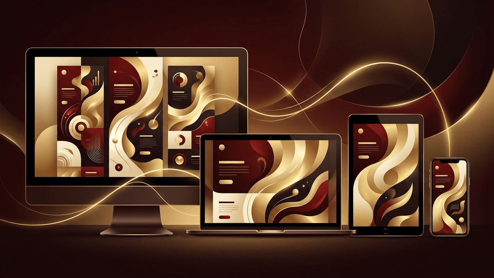
People access websites on an incredible variety of devices: desktop monitors, laptops, tablets, smartphones, foldables, and even smart TVs. Each has a different screen size, resolution, and input method. Designing a separate website for each would be impractical, which is why responsive web design has become the industry standard. So, what is the purpose of responsive web design? In short, it ensures that every visitor enjoys a seamless experience, no matter how they access your site. This article explores its purpose, how it works, and why it is essential for modern businesses.
How AAMAX.CO Creates Responsive Websites for Every Screen
Responsive design requires careful planning, flexible layouts, and thorough testing across devices. AAMAX.CO is a full service digital marketing company that offers web development, digital marketing, and SEO services worldwide. They build every website with a mobile-first mindset, ensuring layouts, images, navigation, and forms adapt smoothly to any screen. Their professional website design services help businesses deliver consistent, polished experiences that keep visitors engaged and improve search visibility.
What Is Responsive Web Design?
Responsive web design is an approach that makes websites automatically adapt their layout, content, and functionality to fit the screen size and orientation of the device being used. Rather than building separate sites for desktop and mobile, a responsive website uses a single codebase that intelligently reorganizes itself.
For example, a three-column layout on a desktop might stack into a single column on a smartphone, navigation menus might collapse into a hamburger icon, and images might resize to fit narrower screens.
The Primary Purpose of Responsive Web Design
The main purpose of responsive web design is to provide an optimal viewing and interaction experience across all devices. This includes easy reading with minimal resizing, panning, or scrolling, and intuitive navigation regardless of screen size. Beyond this core goal, responsive design serves several important purposes:
- Improving user experience: Visitors can easily read, navigate, and interact with content on any device.
- Supporting mobile users: With mobile devices generating a majority of global web traffic, a mobile-friendly experience is essential.
- Boosting SEO: Search engines use mobile-first indexing, meaning the mobile version of your site determines rankings.
- Simplifying maintenance: One website is easier and cheaper to manage than multiple versions.
- Increasing conversions: A smooth experience reduces friction and encourages users to take action.
- Future-proofing: Flexible layouts adapt to new devices and screen sizes as they emerge.
How Responsive Web Design Works
Responsive design relies on several core techniques:
Fluid Grids
Instead of fixed pixel widths, responsive layouts use relative units like percentages, fractions, or viewport units. Modern CSS tools such as Flexbox and CSS Grid make it easy to create layouts that stretch and shrink naturally.
Flexible Images and Media
Images and videos are styled to scale within their containers, preventing them from overflowing small screens. Techniques like the srcset attribute and the picture element allow browsers to load appropriately sized images, improving performance.
Media Queries
CSS media queries apply different styles based on device characteristics, such as screen width. Designers define breakpoints where the layout adjusts, for example, switching from a multi-column to a single-column layout below a certain width.
Mobile-First Approach
Many designers start with the smallest screen and progressively enhance the layout for larger screens. This approach prioritizes essential content and ensures mobile users receive a fast, focused experience.
Business Benefits of Responsive Design
For businesses, responsive design delivers measurable advantages:
- Lower bounce rates: Mobile visitors are less likely to leave when content is easy to consume.
- Higher engagement: Comfortable reading and navigation encourage users to explore more pages.
- Better brand perception: A consistent experience across devices reflects professionalism.
- Cost efficiency: Maintaining a single site reduces development and update costs.
- Improved analytics: Unified tracking across devices simplifies performance analysis.
Responsive vs. Adaptive Design
Adaptive design uses several fixed layouts tailored to specific screen sizes, serving the one that best matches the device. Responsive design uses fluid layouts that adjust continuously. While adaptive design can offer precise control, responsive design is more flexible, easier to maintain, and better suited to the ever-growing variety of devices.
Best Practices for Responsive Web Design
- Design mobile-first and prioritize essential content.
- Use touch-friendly buttons with adequate spacing.
- Ensure text remains readable without zooming.
- Optimize images and use modern formats for faster loading.
- Test across real devices, browsers, and orientations.
- Avoid horizontal scrolling and fixed-width elements.
- Keep navigation simple and accessible on small screens.
- Monitor Core Web Vitals to maintain strong performance.
Conclusion
The purpose of responsive web design is to deliver an excellent, consistent experience to every visitor, regardless of the device they use. By using fluid grids, flexible media, media queries, and a mobile-first mindset, responsive websites improve usability, boost search rankings, simplify maintenance, and increase conversions. In a multi-device world, responsive design is not optional; it is the foundation of effective web design.
