

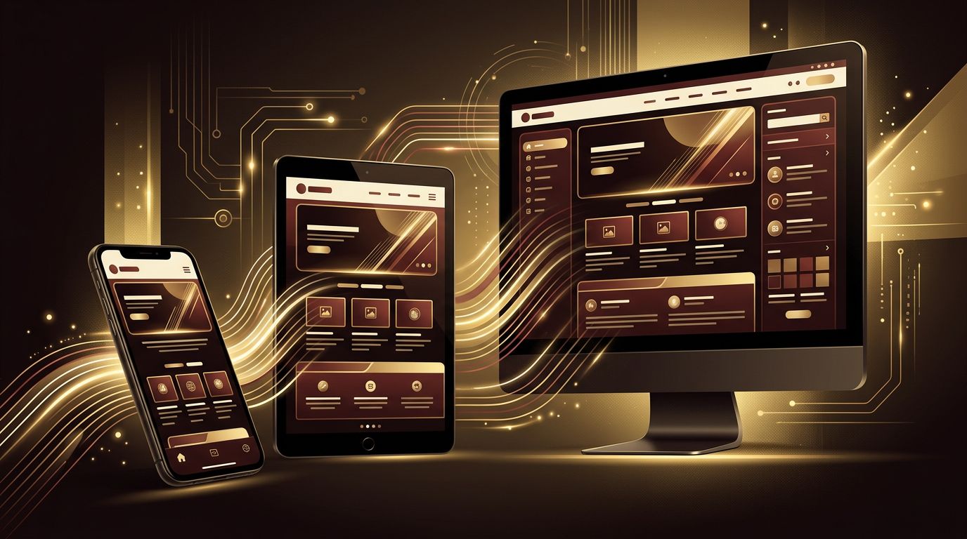
The way people browse the internet has changed dramatically. For a large and growing share of users, a smartphone is the primary, and sometimes only, device they use to access the web. This shift has transformed how websites are designed and built. Mobile-first web design is an approach that starts with the smallest screens and progressively enhances the experience for larger ones. In this article, we will explain what mobile-first web design is, why it matters, how it differs from traditional approaches, and how to implement it effectively.
How AAMAX.CO Designs for a Mobile-First World
Creating websites that perform beautifully on mobile devices requires both design expertise and technical skill. AAMAX.CO is a full-service digital marketing company offering web development, digital marketing, and SEO services worldwide. They build responsive, mobile-first websites that load quickly, look great on every screen, and rank well in search engines. By prioritizing the mobile experience from the very beginning, they help businesses reach and convert customers wherever they are.
What Does Mobile-First Mean?
Mobile-first web design is a strategy in which designers and developers create the mobile version of a website first, then adapt and expand it for tablets, laptops, and desktops. Instead of designing a complex desktop layout and trying to squeeze it onto a small screen, mobile-first design focuses on the essentials and builds upward.
This approach is closely related to the concept of progressive enhancement. You start with a solid, functional core experience that works on the most constrained devices, then add enhancements such as wider layouts, additional columns, and richer interactions as screen size and device capabilities increase.
Mobile-First vs. Desktop-First
Traditionally, websites were designed for desktop screens first. Mobile versions were created afterward, often by hiding content or shrinking elements. This approach, sometimes called graceful degradation, frequently led to cluttered, slow, and frustrating mobile experiences.
Mobile-first reverses this process. By beginning with the smallest screen, designers must prioritize content and features. This leads to cleaner designs, faster load times, and a better experience across all devices. Desktop users benefit too, because the resulting design is focused and free from unnecessary clutter.
Why Mobile-First Design Matters
- Mobile traffic dominates: A majority of web visits in many industries now come from smartphones.
- Search engines prioritize mobile: Google uses mobile-first indexing, meaning it primarily evaluates the mobile version of your site for ranking.
- Better performance: Mobile-first sites tend to be lighter and faster because they start with only the essentials.
- Improved user experience: Focused content and simple navigation help users accomplish tasks quickly.
- Higher conversions: A smooth mobile experience reduces friction and encourages users to take action.
Core Principles of Mobile-First Design
Prioritize content. Small screens force you to decide what matters most. Identify the key messages and actions, and place them front and center. Secondary content can be revealed progressively or placed further down the page.
Design for touch. Mobile users interact with their fingers, not a mouse. Buttons and links should be large enough to tap comfortably, with adequate spacing between them to prevent accidental taps.
Simplify navigation. Mobile navigation should be clean and easy to use. Common patterns include collapsible menus, bottom navigation bars, and clear calls to action. Keep the number of menu items to a minimum.
Optimize for speed. Mobile users may be on slower connections. Compress images, use modern formats, minimize code, and avoid heavy scripts to ensure quick loading.
Ensure readability. Use legible font sizes, comfortable line heights, and strong contrast. Users should never need to zoom to read content.
How to Implement Mobile-First Design in CSS
In practice, mobile-first design often involves writing base CSS styles for small screens, then using media queries with min-width conditions to add styles for larger screens. For example, a layout might display content in a single column by default, then switch to two columns when the screen reaches a tablet width and three columns at desktop width.
This approach ensures mobile devices load only the styles they need, while larger screens receive additional enhancements. Modern CSS tools such as Flexbox, Grid, fluid typography, and container queries make building flexible, mobile-first layouts easier than ever. Including the viewport meta tag in your HTML is also essential so mobile browsers render your page at the correct width.
Mobile-First Design and Images
Images are often the largest files on a web page. In mobile-first design, use responsive image techniques like the srcset attribute and the picture element to deliver appropriately sized images to each device. Lazy loading ensures images below the fold load only when needed, saving bandwidth and improving speed.
Testing Mobile-First Designs
Testing is critical. Use browser developer tools to simulate different screen sizes, but also test on real devices to understand how your website feels in hand. Check tap targets, form usability, loading speed, and readability. Tools like Lighthouse can identify mobile usability and performance issues.
Common Mobile-First Mistakes
Some common pitfalls include hiding important content on mobile, using tiny text or buttons, relying on hover effects that do not work on touchscreens, displaying intrusive pop-ups that cover content, and loading large desktop assets on mobile devices. Avoiding these mistakes ensures a smooth experience for every user.
Mobile-First Beyond Websites
The mobile-first mindset also applies to web applications. Dashboards, booking systems, and customer portals must work just as well on phones as on desktops. Thoughtful web application development ensures complex features remain usable on small screens through adaptive layouts and simplified interactions.
Getting Started With Mobile-First Design
If your current website was built desktop-first, transitioning to a mobile-first approach can feel like a big step. Start by auditing your mobile experience, identifying pain points, and prioritizing the content your users need most. Partnering with experts in website design and website development can help you rebuild your site with a modern, mobile-first foundation.
Conclusion
Mobile-first web design is no longer optional; it is the standard for building modern websites. By starting with the smallest screen, prioritizing essential content, designing for touch, and optimizing for speed, you create experiences that work beautifully across all devices. The result is a faster, more focused website that delights users, performs better in search engines, and drives stronger business results.
