

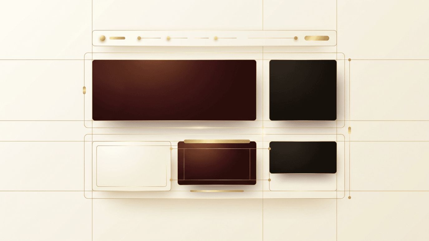
When people think about web design, they usually picture colors, images, and typography. Yet one of the most influential elements on any page is the space where nothing appears at all. Whitespace, also called negative space, is the empty area between and around elements. Used thoughtfully, it improves readability, highlights important content, and gives a website a calm, premium feel. Used poorly, or ignored entirely, it leads to cluttered layouts that overwhelm visitors and drive them away. This article explains how to use whitespace effectively in web design and why it deserves a central place in your design process.
How AAMAX.CO Approaches Thoughtful Layouts
Balancing content and space is a skill refined through experience, which is why many businesses turn to AAMAX.CO. As a full-service digital marketing company offering web development, digital marketing, and SEO services worldwide, they understand that layout decisions directly affect engagement and conversions. Their designers use spacing systems, visual hierarchy, and user research to craft interfaces that feel effortless to navigate. Whether a brand needs a complete redesign or a refined landing page, they can create clean, purposeful layouts that let the message shine.
What Whitespace Really Means
Whitespace does not have to be white. It is any area of a design left free of text, images, or graphics, regardless of the background color. A dark website with generous gaps between sections uses whitespace just as much as a minimalist white page. Designers generally divide it into two categories: macro whitespace, the large spaces between major sections, columns, and around the edges of a layout; and micro whitespace, the small gaps between lines of text, letters, list items, and buttons. Both play essential roles in how a page is perceived.
Why Whitespace Matters
Whitespace improves comprehension. Research on reading behavior has long shown that well-spaced paragraphs and margins make text easier to process. When content is crammed together, the eye has nowhere to rest, and readers quickly feel fatigued. Whitespace also creates focus. An isolated element surrounded by space naturally draws attention, which is why call-to-action buttons often sit alone with ample padding. Finally, whitespace communicates quality. Luxury brands frequently use spacious layouts because space signals confidence and sophistication, while crowded layouts can feel cheap or desperate.
Establish a Consistent Spacing System
The first step to using whitespace effectively is to stop spacing elements by eye. Instead, define a spacing scale, such as multiples of 4 or 8 pixels, and apply it consistently to margins, padding, and gaps. A consistent system creates rhythm, making layouts feel orderly even when users cannot articulate why. Design tools and CSS frameworks make this easy by offering predefined spacing tokens that keep teams aligned across every page and component.
Use Whitespace to Build Visual Hierarchy
Hierarchy tells visitors what to look at first, second, and third. Spacing is one of the strongest hierarchy tools available. Place more space above a heading than below it, so it clearly belongs to the content that follows. Group related elements closely together and separate unrelated groups with larger gaps. This principle, known as proximity, helps users understand relationships without needing borders or dividers. A pricing table, for example, becomes far easier to scan when each plan is separated by generous gutters.
Improve Readability with Micro Whitespace
Typography depends heavily on micro whitespace. Set body line height between roughly 1.4 and 1.7 times the font size to give lines room to breathe. Limit line length to around 50 to 75 characters so the eye can comfortably move from one line to the next. Add space between paragraphs rather than relying on indentation alone. For lists, slight spacing between items prevents them from blending into a dense block. These small adjustments make long-form content dramatically more pleasant to read.
Highlight Calls to Action
If you want visitors to take a specific action, give that action space. Avoid surrounding your primary button with competing links, images, or text. A clear zone around a call to action makes it the obvious next step. The same applies to forms: spacing fields comfortably and keeping labels close to their inputs reduces errors and increases completion rates.
Balance Whitespace on Mobile
Smaller screens make whitespace decisions trickier. You cannot simply copy desktop spacing, as large margins can waste precious screen width. However, cramming content edge to edge creates frustration and accidental taps. Reduce macro spacing proportionally on mobile while preserving enough padding around tappable elements and between text blocks. Testing on real devices is the best way to find the right balance.
Common Whitespace Mistakes
One common mistake is treating empty space as wasted space and filling every gap with banners, widgets, or extra copy. Another is inconsistent spacing, where similar sections use different gaps, making the site feel unpolished. Some designers swing too far the other way, adding so much space that users must scroll endlessly to find information. The goal is balance: enough space to create clarity and focus, but not so much that the content feels disconnected.
Whitespace and Business Results
Effective spacing is not just an aesthetic choice. Clean layouts reduce cognitive load, which keeps visitors on the page longer and makes them more likely to convert. Well-spaced content is also more accessible, benefiting users with cognitive or visual impairments. When planning a new project, treat whitespace as a core part of your website design strategy rather than an afterthought applied at the end.
Conclusion
Learning how to use whitespace effectively in web design can transform an ordinary website into one that feels intuitive, trustworthy, and premium. By establishing a spacing system, using proximity to build hierarchy, refining typography, and giving calls to action room to stand out, you create layouts that guide visitors naturally toward their goals. Sometimes, the most powerful design decision is choosing what to leave out.
