

Formatting determines whether visitors stay on your web page or leave within seconds. Even the most valuable content can be overlooked if it appears as a cluttered wall of text, uses hard-to-read fonts, or lacks a clear structure. A well-formatted page, by contrast, guides the eye naturally, highlights what matters most, and makes information easy to digest. Whether you are building a page in a website builder, a content management system, or with code, the principles of good formatting remain the same. This guide covers those principles so you can create web pages that look professional and keep visitors engaged.
Elevate Your Web Pages with AAMAX.CO
Professional formatting requires an eye for design and an understanding of how users interact with content. AAMAX.CO is a full-service digital marketing company offering web development, digital marketing, and SEO services worldwide. Their designers create thoughtfully structured pages with clear hierarchy, balanced layouts, and engaging visuals that turn visitors into customers. Businesses seeking expert website design can rely on them to format every page for maximum readability, impact, and conversion.
Start with a Clear Purpose and Structure
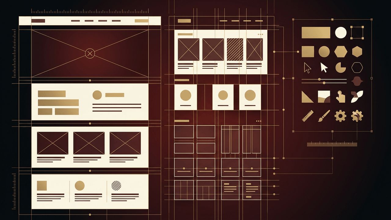
Every web page should have a single primary goal, such as encouraging a purchase, capturing a lead, or educating readers. Once you know the goal, outline the page structure. Most effective pages include a header with navigation, a hero section that introduces the main message, supporting content sections, social proof such as testimonials, a clear call to action, and a footer with contact details and secondary links. Planning this structure before adding content prevents a disorganized result.
Establish Visual Hierarchy
Visual hierarchy tells visitors what to look at first, second, and third. Use size, weight, color, and position to signal importance. The main headline should be the most prominent element, followed by subheadings and body text. Place key information and calls to action where users naturally look, typically near the top and along the left side for left-to-right languages. Many users scan pages in an F-pattern or Z-pattern, so align important elements with these reading paths.
Choose Readable Typography
Typography has a major influence on readability. Choose one or two typefaces at most, typically one for headings and another for body text. Use a body text size of at least 16 pixels, with a line height of around 1.5 to 1.7 for comfortable reading. Keep line lengths between roughly 50 and 75 characters, since extremely long lines are tiring to read. Use bold sparingly to emphasize key phrases, and avoid writing long passages in all capital letters.
Break Content into Scannable Sections
Online readers tend to scan rather than read every word. Help them by breaking content into short paragraphs of two to four sentences. Use descriptive headings and subheadings that summarize each section. Bulleted and numbered lists present steps, features, or benefits clearly. Pull quotes, highlighted boxes, and summary sections can draw attention to important insights. Scannable content improves both user experience and search engine optimization.
Use White Space Generously
White space, or negative space, is the empty area around and between elements. It gives content room to breathe, reduces visual clutter, and directs attention to important elements. Use consistent spacing between sections, paragraphs, and components. A spacing scale, such as multiples of 4 or 8 pixels, keeps the layout consistent. Do not be afraid of empty space; it makes pages feel premium and easier to navigate.
Apply a Consistent Color Scheme
Choose a limited color palette based on your brand, typically including a primary color, a secondary or accent color, and neutral tones for backgrounds and text. Use your accent color strategically for buttons and links so they stand out. Ensure sufficient contrast between text and background colors to meet accessibility guidelines, which benefits all users, especially those with visual impairments.
Incorporate Relevant Images and Media
Images, illustrations, icons, and videos break up text and communicate ideas quickly. Use high-quality visuals that support your message rather than generic stock photos. Optimize images for fast loading, provide descriptive alt text for accessibility and SEO, and maintain consistent styles across the page. Align images with text thoughtfully, and avoid overcrowding sections with too many visual elements.
Design Clear Calls to Action
Calls to action tell visitors what to do next. Use action-oriented language such as "Get a Free Quote" or "Start Your Trial." Make buttons visually distinct with contrasting colors, sufficient padding, and clear labels. Place calls to action at logical points throughout the page, not just at the bottom, so users can act whenever they are ready.
Optimize for Mobile Devices
A large share of web traffic comes from mobile devices, so your formatting must adapt to small screens. Use a responsive layout that stacks columns vertically, enlarge tap targets, keep text sizes readable, and simplify navigation with a mobile-friendly menu. Test your page on multiple devices to ensure formatting remains clean and functional.
Conclusion
Formatting a web page effectively involves a clear structure, strong visual hierarchy, readable typography, scannable content, generous white space, a consistent color scheme, meaningful imagery, compelling calls to action, and mobile optimization. When these elements come together, your page becomes easier to read, more attractive, and more effective at achieving its goals. For businesses that want professionally formatted web pages that drive results, AAMAX.CO offers the design and development expertise to make it happen.
