

Creating a web design is far more than picking attractive colors and dropping a logo into the corner of a page. A great web design is a carefully planned system that balances aesthetics, usability, accessibility, performance, and business goals. Whether you are designing a portfolio, a small business site, or a large ecommerce platform, the same core principles apply: understand your audience, structure your content, and craft a visual language that communicates clearly.
In this guide, you will learn a practical, step-by-step process for creating web design from the first idea to a polished, launch-ready layout. You will also discover the tools, habits, and best practices professional designers rely on to produce work that looks great and performs even better.
Work With AAMAX.CO for Professional Web Design
If you want expert results without spending months learning every design discipline yourself, AAMAX.CO is a strong partner to consider. They are a full service digital marketing company offering web development, digital marketing, and SEO services to clients worldwide. Their team handles everything from research and wireframes to high-fidelity visuals, so their clients receive a site that reflects their brand and supports measurable growth. Businesses that hire them for website design benefit from a process that blends creativity with conversion strategy, which is exactly what this guide describes.
Start With Research and Clear Goals
Every successful design begins with questions. Who is the website for? What problem does it solve? What action should visitors take? Write down your primary goal, such as generating leads, selling products, or building authority, and identify two or three secondary goals. Next, research your audience: their age, devices, expectations, and pain points. Finally, study competitors and note what works and what feels outdated. This research becomes the foundation for every design decision you make later.
Plan Your Site Structure and Content
Before you open a design tool, map out your sitemap. List every page you need, such as Home, About, Services, Blog, and Contact, and arrange them into a logical hierarchy. Then outline the content for each page. Designers often say "content first" because layouts should be built around real messages, not placeholder text. Knowing your headlines, calls to action, and supporting copy helps you allocate space correctly and avoid awkward redesigns later.
Create a Content Hierarchy
On each page, decide what visitors must see first, second, and third. The most important message usually belongs in the hero section, followed by proof points, features, testimonials, and a closing call to action. A clear hierarchy reduces cognitive load and keeps people moving toward your goal.
Sketch Wireframes Before Visual Design
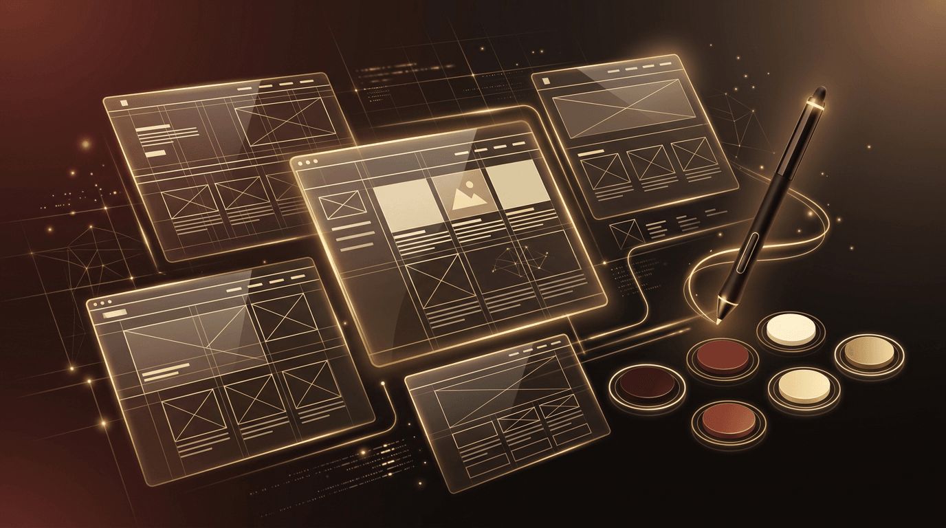
Wireframes are simple, grayscale layouts that show where elements will go without worrying about colors or images. Start with paper sketches or a tool like Figma, Penpot, or Balsamiq. Focus on layout, spacing, navigation, and the flow from one section to the next. Wireframing is fast and inexpensive, which makes it the perfect stage to experiment, gather feedback, and fix structural problems before they become costly.
Define Your Visual Style
Once the structure is approved, it is time to bring the design to life. A cohesive visual style relies on a few deliberate choices:
- Color palette: Choose three to five colors, including a primary brand color, a neutral background, and an accent for calls to action. Check contrast ratios for accessibility.
- Typography: Pair no more than two font families, one for headings and one for body text. Set a consistent type scale for headings, paragraphs, and captions.
- Imagery: Use high-quality photos or illustrations that share a consistent tone and style.
- Spacing: Adopt a spacing system, such as multiples of eight pixels, to keep layouts balanced.
Documenting these choices in a simple style guide or design system ensures every page feels like part of the same brand.
Design for Every Screen Size
More than half of web traffic comes from mobile devices, so responsive design is not optional. Start designing for small screens first, then expand the layout for tablets and desktops. Mobile-first thinking forces you to prioritize content and keep interfaces lean. Make sure buttons are large enough to tap, text remains readable without zooming, and navigation collapses into an intuitive menu on smaller screens.
Prioritize Usability and Accessibility
A beautiful design fails if people cannot use it. Follow established usability conventions: place navigation where users expect it, make links look clickable, and keep forms short. For accessibility, provide sufficient color contrast, write meaningful alt text for images, use proper heading structure, and ensure the site can be navigated with a keyboard. Accessible design widens your audience and often improves SEO as well.
Build Interactive Prototypes
Static mockups only tell part of the story. Interactive prototypes let you click through pages, test hover states, and simulate user journeys. Share prototypes with stakeholders and a few real users, then watch how they navigate. You will quickly spot confusing labels, missing information, or buttons that are hard to find. Iterating at this stage is far cheaper than changing code after development.
Optimize for Performance and SEO
Design choices directly affect page speed. Oversized images, too many custom fonts, and heavy animations can slow a site down and hurt search rankings. Work with compressed image formats like WebP, limit font weights, and use motion sparingly. Plan for SEO by leaving room for descriptive headings, internal links, and keyword-rich content that matches what your audience searches for.
Hand Off and Test Thoroughly
When the design is final, prepare a clean handoff for developers. Organize layers, name components clearly, export assets, and document interactions. After development, test the live site across browsers and devices. Check alignment, spacing, form behavior, and loading speed. Gather analytics after launch to see how real users behave, and continue refining based on data.
Common Web Design Mistakes to Avoid
- Cluttered layouts with too many competing elements
- Low-contrast text that strains the eyes
- Inconsistent fonts, buttons, and colors across pages
- Hidden or confusing navigation
- Ignoring mobile users until the end of the project
Conclusion
Learning how to create web design is a journey that combines research, structure, creativity, and continuous testing. By setting clear goals, planning content, wireframing, establishing a consistent visual style, and designing responsively, you can produce websites that look professional and deliver results. If you prefer to focus on running your business while experts handle the details, partnering with an experienced agency can help you launch a stunning, high-performing website faster and with far less stress.
