

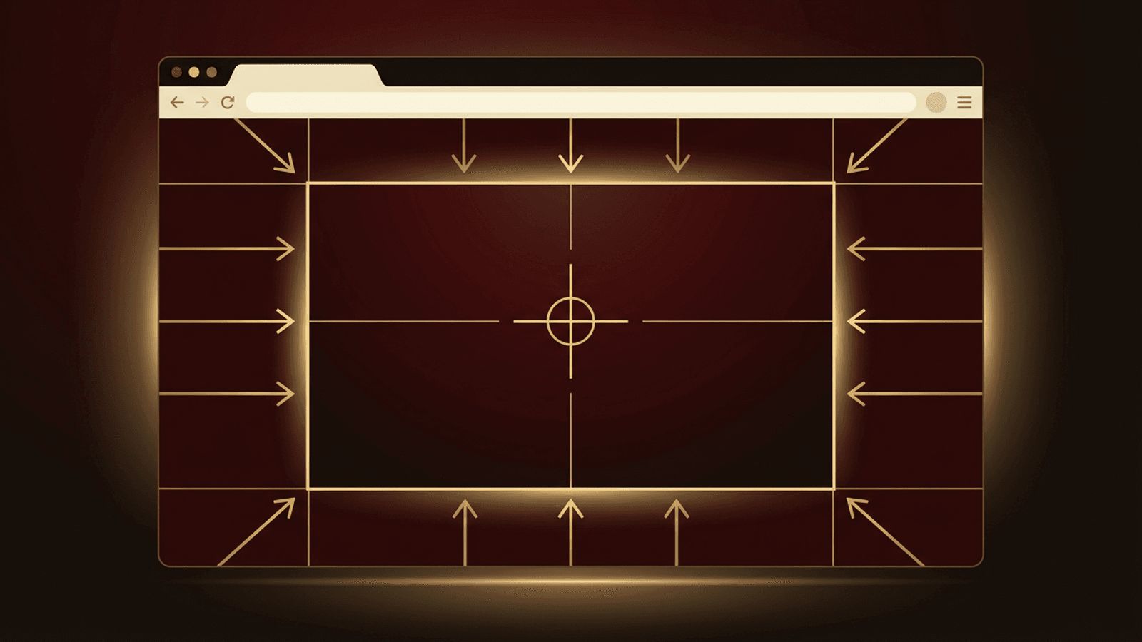
Centering is one of the most common layout tasks in web design. A page that sits neatly in the middle of the browser window looks balanced, readable, and professional, especially on large desktop monitors where full-width text becomes difficult to read. Yet centering has historically been a source of frustration for developers. Fortunately, modern CSS provides simple, reliable techniques to center an entire web page horizontally, vertically, or both. This guide walks through the best methods and explains when to use each one.
Professionally Designed Layouts by AAMAX.CO
Great layout is about more than centering; it is about creating balanced, responsive experiences that guide visitors toward action. AAMAX.CO is a full service digital marketing company that offers web development, digital marketing, and SEO services worldwide. Their designers and developers craft pixel-perfect layouts that look polished on every device. If you want a site where every element is thoughtfully positioned, their website design services deliver clean, modern interfaces built on solid CSS foundations.
Why Center a Web Page?
On wide screens, content stretched across the full width creates long lines of text that tire the eyes. Typography experts recommend line lengths of roughly 50 to 75 characters for comfortable reading. Centering a content container with a maximum width keeps lines readable, creates pleasant white space on both sides, and gives the page a structured, intentional appearance.
Method 1: Max-Width and Auto Margins
The most common way to center a page horizontally is to wrap your content in a container with a maximum width and automatic left and right margins:
.container {
  max-width: 1200px;
  margin-inline: auto;
  padding-inline: 1rem;
}
The browser calculates equal margins on both sides, placing the container in the center. Using max-width instead of width ensures the container shrinks gracefully on smaller screens, while padding prevents content from touching the screen edges on mobile devices. The margin-inline property is the modern logical equivalent of setting margin-left and margin-right to auto.
Method 2: Centering With Flexbox
Flexbox makes it easy to center content both horizontally and vertically. To center a page's content in the middle of the viewport:
body {
  min-height: 100vh;
  display: flex;
  justify-content: center;
  align-items: center;
  margin: 0;
}
The justify-content property centers along the main axis, and align-items centers along the cross axis. This approach is ideal for landing pages, login screens, and splash pages where a single block of content should sit in the exact center of the screen.
Method 3: Centering With CSS Grid
CSS Grid offers an even shorter way to center content in both directions:
body {
  min-height: 100vh;
  display: grid;
  place-items: center;
  margin: 0;
}
The place-items shorthand sets both align-items and justify-items to center. Grid is particularly useful when your layout already relies on grid areas or when you want a concise, readable solution.
Method 4: Centering Text
If you only need to center text or inline elements like images and buttons within a container, use text-align:
.hero { text-align: center; }Keep in mind that centered text works well for headings and short passages but can reduce readability for long paragraphs. Left-aligned body text is generally easier to scan.
Using Modern Viewport Units
On mobile browsers, the 100vh unit can be taller than the visible area because of dynamic address bars. Modern CSS introduces dynamic viewport units like 100dvh, which adjust to the actual visible height. Using min-height: 100dvh provides more accurate vertical centering on phones and tablets.
Centering in Popular Frameworks
If you use a CSS framework, centering is often built in. In Tailwind CSS, classes like mx-auto max-w-6xl center a container horizontally, while flex items-center justify-center or grid place-items-center center content in both directions. Bootstrap provides a container class that automatically centers content with responsive widths.
Common Centering Mistakes
- Using auto margins without setting a width or max-width, which has no visible effect.
- Forgetting to give the parent a height when centering vertically.
- Using fixed widths that cause horizontal scrolling on mobile devices.
- Relying on outdated techniques like absolute positioning with negative margins when modern methods are simpler.
- Leaving the default body margin, which can create slight offsets.
Testing Your Centered Layout
After implementing your layout, test it across different screen sizes using browser developer tools. Check that content remains centered, readable, and free from horizontal scrolling on small screens. Also verify that vertically centered content does not get cut off when it is taller than the viewport; using min-height rather than height prevents this problem.
Choosing the Right Method for Your Project
Each centering technique has an ideal use case. For content-heavy websites such as blogs, documentation, and business sites, a max-width container with auto margins is usually the best choice because it keeps text readable while allowing the page to scroll naturally. For single-focus screens like login forms, error pages, and promotional splash pages, Flexbox or Grid centering creates a clean, focused presentation. Many professional websites combine both approaches: a centered container controls the overall page width, while Flexbox or Grid aligns individual sections, cards, and buttons inside it. Defining these patterns as reusable classes or components keeps your layouts consistent across every page.
Conclusion
Centering a web page is easy with modern CSS. Use a max-width container with auto margins for classic horizontally centered layouts, Flexbox or Grid for centering content both horizontally and vertically, and text-align for inline content. Combine these techniques with responsive units and thorough testing to create balanced, professional pages that look great on every device.
